When you think of maps what is the first thing that comes to your mind? A treasure map perhaps? We see maps everywhere. In older times people used paper maps and today we have google maps but one thing remains the same is that they still help us. Maps can be used to get us from one location or another or to see how something is moving/growing. A huge use for maps that no one really thinks about is that they are used to map the spread of sickness. Mapping the spread of sickness is something that has been done for a long time and it is still being done today.
“A map does not just chart, it unlocks and formulates meaning; it forms bridges between here and there, between disparate ideas that we did not know were previously connected.”
Reif Larsen
Blast in the Past
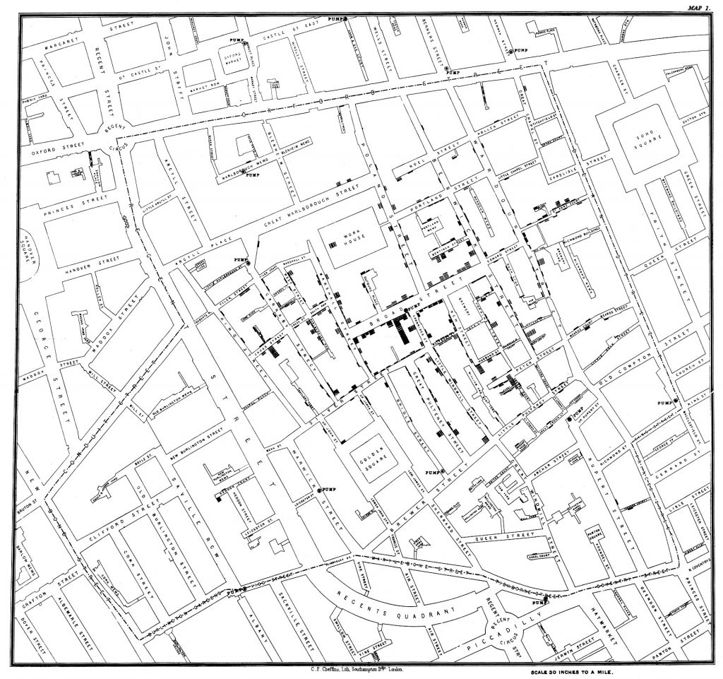
Around 1345 something ugly decided to show its face in Eurasia and northern Africa. This ugly thing was called the “Black Plague”. The “Black Plague” spread like wildfire through Asia along the silk road to Europe where it killed anywhere between 30%-60% of the population there. It was spread from fleas to people where it caused a pneumonic plague that allowed the disease to be spread through the air. Due to the fact that this disease could be spread through the air it because very hard to bring under control. While this plague was occurring no one really kept track of it and where it came from so that became the job of historians. When digging in mass graves dating back to around 1338-1339 in Kyrgyzstan scientists discovered inscriptions that referred to the plague leading scientists to think that this could be the origin of the “Black Death”. Using this starting point historians followed and mapped the plague throughout Asia and to Europe. A famous example of maps being used to help map out and stop a plague was in 1854 when John Snow’s maps of the Cholera outbreak in London helped lead to the contaminated water pump being shut down. Due to Snow’s maps many potential victims were saved.

Tie to today
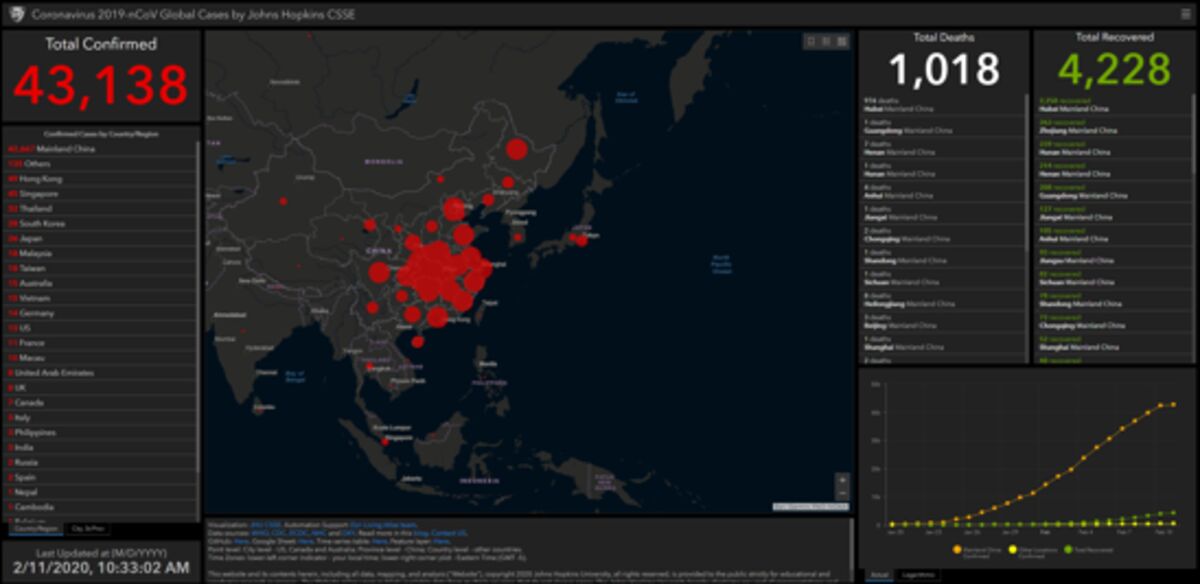
As everyone in the world knows we are currently going through our own pandemic that is still a little new to us even a year after the first cases were reported. Some people are still trying to cope with the mental and physical stress of schools being shut down and others losing jobs. As new as shutdowns and quarantines seem they have been going on for over 700 years. Almost all the happenings during this Covid-19 pandemic stem from somewhere in history, including how Covid-19 is being tracked. People are no longer using paper maps, but they are still using maps. How many times have you checked to see if your state is green or red? You are, in a sense, tracking Covid-19 in your state. On a much grander scale, due to the internet and better communication, we are able to track Covid-19 cases all over the world. Scientists in West Virginia are able to talk to scientists in India about new Covid-19 cases and treatments. This improved communication has also improved the quality and accuracy of maps that can be produced. Healthcare officials are now using something called the Geographic information system (GIS). This system helps healthcare officials create theories as to why an outbreak is happening based off of the clustering of bodies.

Why it is Important
Why are maps of plagues even important you may ask. Over the centuries people have used maps to find all sorts of information and goods. The most memorable for this would be treasure maps. Using a given map people would be able to figure out where the hidden treasure is. The maps for plagues are similar to this in a sense, except for it tells you what to avoid instead of finding you treasure. When health officials use GSI to track a sickness they plot it out on a map very similar to the X mark on a treasure map. Now you may be thinking “This still doesn’t tell me why this is important.” but I’m getting there. Going back to the treasure map analogy when you look at the map of a plague as a general person it can help you to avoid areas where the sickness has large numbers to help keep you and your family safe.

Sources Cited:
al-Manbijī, M., et al. “Flea and ANT: Mapping the Mobility of the Plague, 1330s–1350s.” Postmedieval, Palgrave Macmillan UK, 26 June 2013, link.springer.com/article/10.1057/pmed.2013.9.
Frerichs, Ralph R. “Disease Maps, History, and More.” American Journal of Public Health, American Public Health Association, May 2017, www.ncbi.nlm.nih.gov/pmc/articles/PMC5388979/.
Galanaud, Pierre, et al. Historical Epidemics Cartography Generated by Spatial Analysis: Mapping the Heterogeneity of Three Medieval “Plagues” in Dijon. 1 Dec. 2015, www.ncbi.nlm.nih.gov/pmc/articles/PMC4666600/.
Green, Monica H. “The Black Death Map.” Carto Graphia, 2019, www.carto-grafia.com/es/354-the-black-death-map.
Patino, Marie. “Coronavirus Outbreak Maps Rooted in History.” Bloomberg.com, Bloomberg, 11 Feb. 2020, 13:34, www.bloomberg.com/news/articles/2020-02-11/coronavirus-outbreak-maps-rooted-in-history.
SCIENCE COUNTS POLLEN OF RAGWEED: ANNUAL CENSUS MAPS AREAS IN WHICH HAY FEVER OCCURS FROM AIR INFECTION FLIGHT OR TREATMENT. THE REGION AFFECTED. (1930, Aug 24). New York Times (1923-Current File) http://unh-proxy01.newhaven.edu:2048/login?url=https://www-proquest-com.unh-proxy01.newhaven.edu/docview/98855711?accountid=8117
