As of April 2022, global cases of Covid-19 have exceeded 508 million and 6 million deaths. Tracking positive cases and hot spots is extremely important in the face of pandemics. This enables the government and citizens to make informed decisions in light of the events. This emphasis on case tracking is something that was seen with Covid where local, national, and global dashboards were available to everyone with internet to follow the number of cases and how they were fluctuating in different areas. The availability of this data has become critical in deciding mandates and restrictions in different areas and when to lift them. A particularly popular source has been the John’s Hopkins dashboard (“Covid-19 Map”). This dashboard provides information on global and US cases, deaths, vaccinations, fatality ratios, and other information and data. The data is displayed on the world or US map as well as in graphs and other visuals (Figure 1).
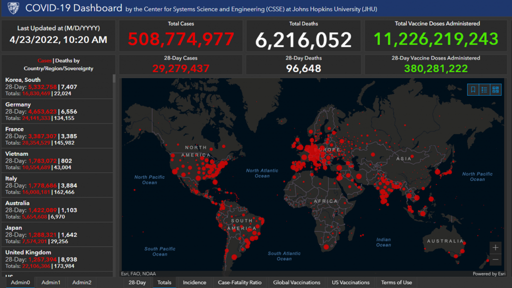
Tracking of case numbers visually by areas is not something that is new to Covid. Hand-drawn maps were originally used to visualize case numbers and their distribution before technological advancements evolved into what we see today. This article will cover some of the original pandemic tracking maps, the technology that we see today, and the benefits of maps in tracking pandemics.
The Original Maps
The earliest cases of maps visualizing the relationship between location and health is seen in 1694 in Italy when trying to contain the plague (Kamel Boulos 2). Over the next 255 years, it has evolved into tracking yellow fever, cholera, the 1918 influenza, and modern pandemics such as Zika, Ebola, and Covid. The cholera pandemic in particular saw a large number of different maps attempting to track the pandemic. “In the 19th century, mapping would be a principal means of surveying the incidence of public disease and, on that basis, arguing the potential source of an outbreak on one or another scale, and thus the best public response to disease incidence” (Koch 1015). Cholera occurred in a time of debate about the source of disease when many people still believed the concept of miasma – bad air – to be the cause. Today we know that cholera is from drinking contaminated water, but maps of the time helped to convince people of this new concept.
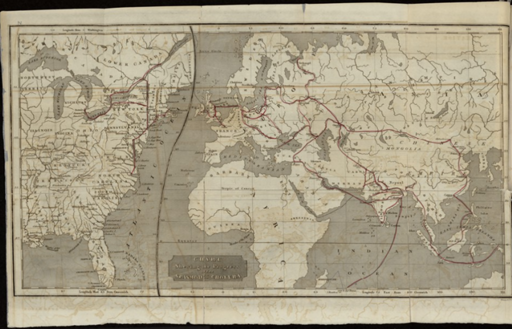
In 1831, the Lancet mapped the progress of cholera through Asia, Europe, and Africa. This map used dots to represent outbreaks and assumed that all cases were the same type of disease which we now know to be false as there are 15 types of cholera that were identified in the corpses (Koch 1015). In 1832, Amariah Brigham, an American physician, created a world map of cholera’s diffusion in all major cities from India to the USA (Koch 1015). He also included redlines on the map to show the major sea and land travel routes (Figure 2). This map shows the likely route that the disease takes in traveling from one area to another and indicates that major travel routes are a source of concern for the spread of the disease.
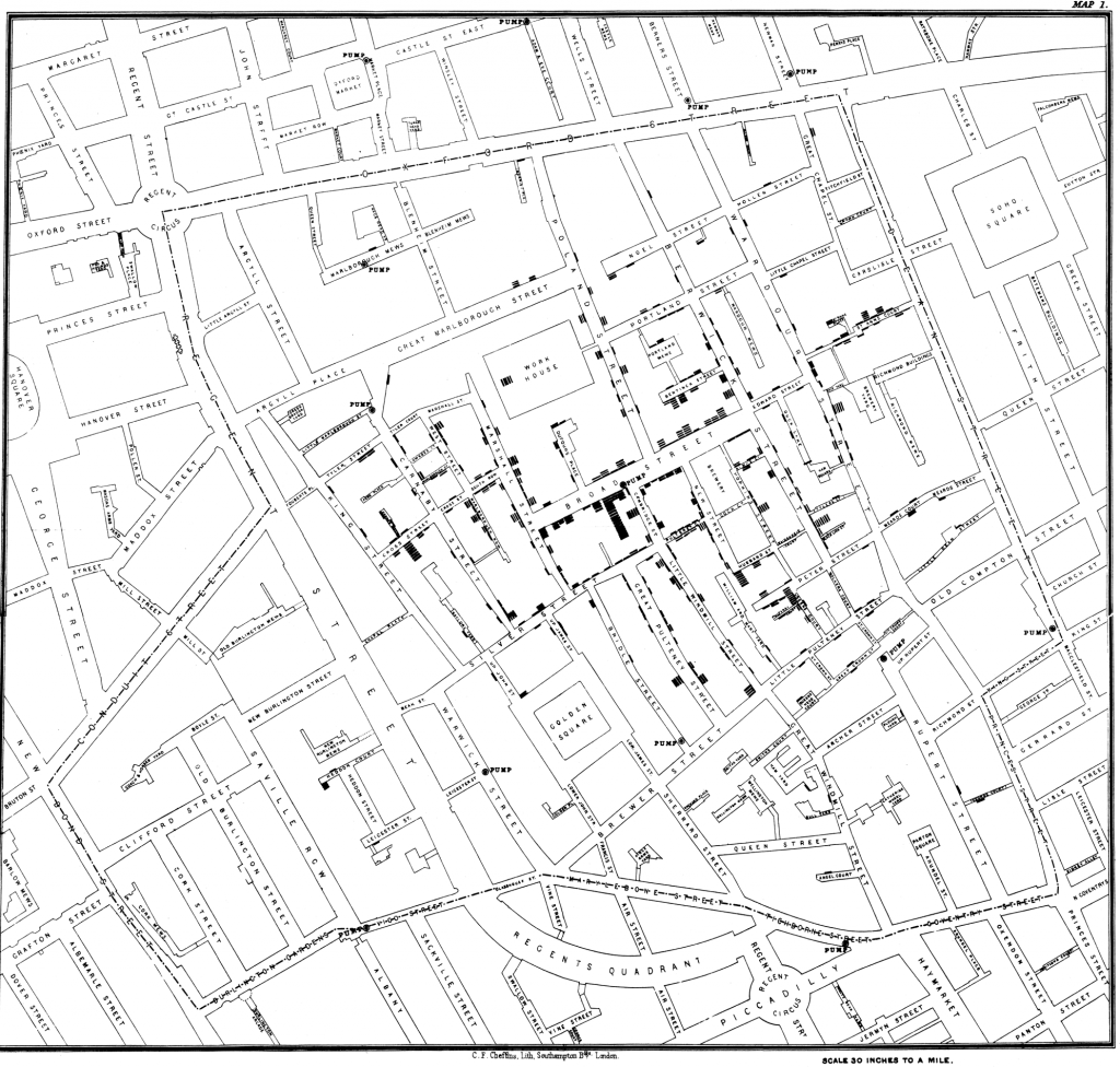
Though the maps of 1832 were the first to trace the global spread of Cholera, most people are usually more familiar with the maps created by John Snow (Schuetze). John Snow’s dot map for the cholera outbreak at London’s Broad Street is one of the most famous original maps that many see as the start of epidemiology (Brockmeier). This map was created in the fall of 1854 (Johnson 193). The map in Figure 3 shows Snow’s map of Broad Street where each black line represents a cholera death, and the water pumps are denoted by circles. Visually, his map was able to help see that cases were radiating out from a single point, which was the pump. “John Snow was able to trace the source of a cholera outbreak in Soho, London, in 1854, thanks to his well-known manual spatial analysis exercise using hand-drawn paper maps of cholera cases and water pumps/water companies supplying them with water” (Kamel Boulos 10). During this time period, maps were seen as a way to track disease progression and trace it back to a source. Snow himself described his map “as a diagram of the topography of the outbreak” when defending its correctness (Snow).
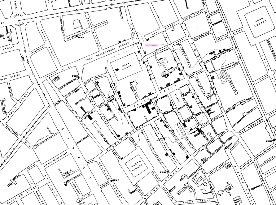
Snow’s second map was based on a Voronoi diagram and was used to visualize how people move in the neighborhood and which pump they would go to (Figure 4). Snow is the first to apply this to disease mapping. Figure 4 shows a dotted line around the center area of the map. Inside this area are the homes that would use the Broad Street pump for their water. Outside of this shape, people go to other pumps to get their water. The map shows that most cases are inside of the shape and the people get their water from the same pump, helping to prove Snow’s theory of water as the source of the disease. Snow’s maps are groundbreaking because they not only helped to determine the source of the disease but also helped to determine the appropriate measures to implement to prevent further spread. As a result of Snow’s work, the board of health removed the pump handle on the infected Broad Street pump. And while the public response to this event was not positive and despite the fact that Cholera was already naturally on the decline, this showed the benefits of maps in visualizing the way a disease moves and how it can be combated.
health professionals have long considered conventional mapping, and more recently geographic information systems (GIS), as critical tools in tracking and combating contagion.
(Kamel Boulos 2)
GIS Technology
Today, GIS technology or geographic information science, systems and software, is used to track and visualize disease and pandemics as well as for tracking various other data. With the speed of disease outbreaks, it is important that information is able to move as quickly as the disease and to be presented in an understandable way. This is where map-based dashboards become so important (Kamel Boulos 2). Maps are useful tools for broadcasting information on disease because people are more likely to look at and understand visual information than written information (Tribolet). The human brain thinks in pictures and maps capitalize on this with a visual display of important information. GIS advances have made this information on maps easier to process quickly which is imperative in the face of a crisis.
Modern Map Uses and Benefits
There are many benefits to GIS technology that is used today. Maps are no longer paper drawings that only show the source of disease or where it is spreading. GIS can be used to track disease location and progress, to determine the source of a disease, to determine which measures to implement to reduce spread, and many other purposes. This modern mapping technology can use demographic data such as “age, race, income, and the presence of comorbidities” to make correlations between cases and these demographics in different areas (Brockmeier). It can also be used to make graphs or visuals of how case numbers change after states reopen or in prisons, nursing homes, or other locations of interest (Brockmeier). They can also serve as predictive tools to determine possible future patterns and travel. Maps were used to track flights after the outbreak in Wuhan to determine how many travelers left the area, where they ended up, and to predict the likely spread of Covid from Wuhan and the risk areas (Kamel Boulos 9). GIS technology can also help to determine where to focus resources and aid as well as to determine areas where specific interventions were successful or failures.
Maps can also serve as an everyday resource for citizens as they attempt to navigate through the pandemic. As seen during Covid, residents can use online maps to determine which hospitals have available beds, clinics that are open with wait times, grocery stores and pharmacies that are open, stores that are selling PPE and other equipment, and much more (Kamel Boulos 10). Maps provide real-time data in local areas which increases transparency and helps to spread important information.
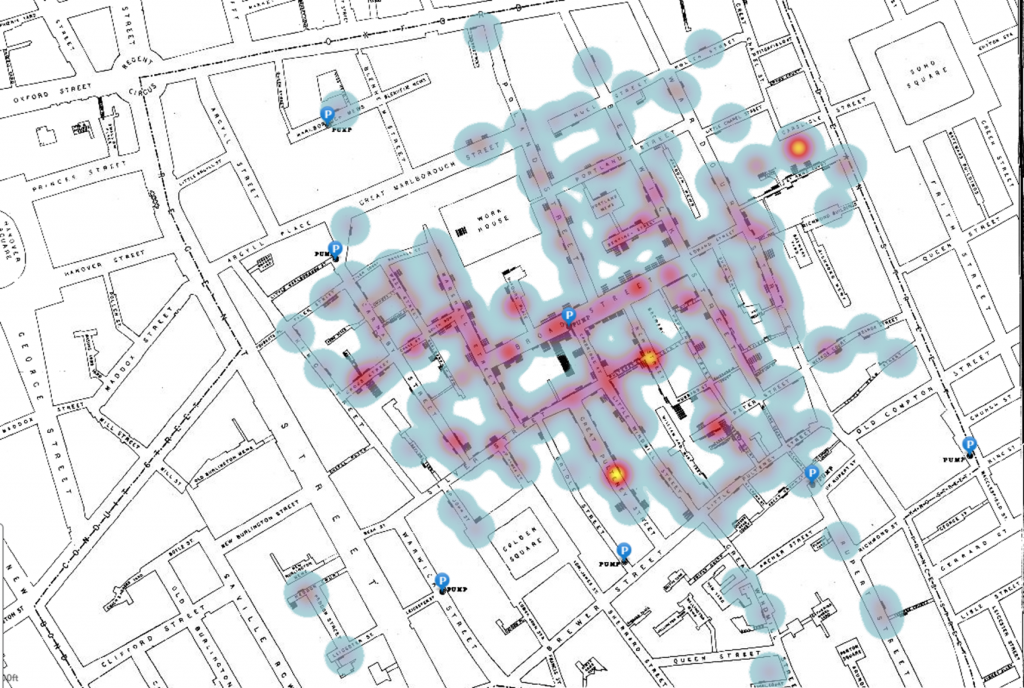
One additional way GIS can be used is to apply it to historical maps of previous pandemics. This can help to better visualize what the maps were describing. For example, John Snow’s map of the Cholera outbreak that is displayed in Figure 3 above can be reexamined using GIS to make it more clear to the average viewer. Figure 5 shows an image of Snow’s map overlayed with GIS technology to see the hot spots of cases as well as the pump locations more easily. This helps anyone to visualize that the cases were clustered around this pump. GIS technology makes the correlation much easier to see visually and understand quickly.
Conclusion
Today’s technology has made maps essential as a main source of information in the face of pandemics. GIS technology allows users to understand the progress of the disease in their area and allows officials to make informed decisions about what measures to implement and then to track if the measures are working. The maps can also have a profound impact in deciding how to manage resources such as PPE, food, temporary or permanent emergency treatment facility locations, and other aid as well as to meet supply and demand needs (Brockmeier). Modern technology has also allowed researchers to reexamine prior pandemics in a new light and to better understand these events. This is important to epidemiologists who study past pandemics to get a better understanding of the type of pandemic we are experiencing today (Tucker). The use of maps has extended past what they were originally used for in tracking case densities and finding sources. What started as simple hand-drawn maps of the 19th century has evolved into the field of epidemiology that we see today.
Works Cited
“Covid-19 Map.” Johns Hopkins Coronavirus Resource Center, https://coronavirus.jhu.edu/map.html.
“How to Track the Spread of Viruses Using GIS.” GIS Geography, 29 Oct. 2021, https://gisgeography.com/how-to-track-spread-virus-gis/.
Brockmeier, Erica K. “Maps, Pandemics, and Reckoning with History.” Penn Today, 10 Aug. 2020, https://penntoday.upenn.edu/news/maps-pandemics-and-reckoning-history.
Foster, Stephanie, et al. “Geographic Information System Data.” Centers for Disease Control and Prevention, 13 Dec. 2018, https://www.cdc.gov/eis/field-epi-manual/chapters/GIS-data.html.
Johnson, Steven. The Ghost Map. Riverhead Books, 2006.
Kamel Boulos, M.N., Geraghty, E.M. “Geographical tracking and mapping of coronavirus disease COVID-19/severe acute respiratory syndrome coronavirus 2 (SARS-CoV-2) epidemic and associated events around the world: how 21st century GIS technologies are supporting the global fight against outbreaks and epidemics.” Internationl Journal of Health Geographics 19, 8 (2020). https://doi.org/10.1186/s12942-020-00202-8
Koch, Tom. “1831: the map that launched the idea of global health.” International journal of epidemiology vol. 43,4 (2014): 1014-20. doi:10.1093/ije/dyu099
Schuetze, Sarah. “Mapping a Demon Malady: Cholera Maps and Affect in 1832.” Commonplace: the journal of early American life, 23 Mar. 2020, http://commonplace.online/article/mapping-a-demon-malady/.
Snow, John. “Dr. Snow’s Report.” The John Snow Archive and Research Companion, 1855, http://kora.matrix.msu.edu/files/21/120/15-78-2BD-22-Doc26-IV-RprtToCIC.pdf.
Tribolet, Anna. “The Role of GIS during a Pandemic: Why the ‘Where’ Is so Important for the Coronavirus.” Utah Geospatial Research Center, 15 June 2020, https://gis.utah.gov/the-role-of-gis-during-a-pandemic-why-the-where-is-so-important-for-the-coronavirus/.
Tucker, Neely. “Mapping Pandemics at the Library.” Mapping Pandemics at the Library | Library of Congress Blog, 23 Apr. 2020, https://blogs.loc.gov/loc/2020/04/mapping-pandemics-at-the-library/.
Images Cited
“COVID-19 Dashboard by the Center for Systems Science and Engineering (CSSE) at Johns Hopkins University.” Johns Hopkins Coronavirus Resource Center, https://coronavirus.jhu.edu/map.html.
Brigham, Amariah. “A Treatise on Epidemic Cholera: Including an Historical Account of Its Origin and Progress, to the Present Period : Compiled from the Most Authentic Sources.” U.S. National Library of Medicine, National Institutes of Health, 1832, https://collections.nlm.nih.gov/bookviewer?PID=nlm%3Anlmuid-34630680R-bk.
“File:Snow-Cholera-Map-1.Jpg.” Wikipedia, Wikimedia Foundation, 23 Oct. 2021, https://en.wikipedia.org/wiki/John_Snow#/media/File:Snow-cholera-map-1.jpg.
“John Snow, Map Depicting Cholera Mortality during the Outbreak, with Equidistant Walking Lines between the Broad Street Pump and Nearest Rival Pumps.” The John Snow Archive and Research Companion, http://kora.matrix.msu.edu/files/21/120/15-78-298-22-1855-08-Snow-CICmap-Beem02.pdf.
“Cholera Outbreak, 1854.” Arcgis.com, Esri, https://www.arcgis.com/home/webmap/viewer.html?webmap=75237a7d4b7547c1b3addf9ffcd380fa.

