
This infographic about health helps us think about best practices for design. The image appears on the Benefits and Pensions Monitor website in a post by Jonalyn Cueto and is being used under fair use (the creator retains the copyright).
Research Question of the Day: “How does design affect medical infographics? And is there a difference in the effect between medical and non-medical professionals?”
by Jillian Lockwood
I chose this topic because I am a Graphic Design major, and at the beginning of this class, I was starting to see all of the different ways the information within the infographics shown could be altered to be more effective. This class session will be developed around the psychology of color theory, the hierarchy of information within the graphic design world, and the effectiveness of these disciplines within the medical world. We will be looking at 2 infographics to analyze and use close looking skills to identify what you think is a good or bad design. You are going to be designing a very rough draft of an infographic using the information provided to you later on in the class. This will be a great way to wake up the creative side of your brain and give you a break from all of the normal day-to-day tasks you have to do.
“Visual hierarchy controls the delivery of the experience. If you have a hard time figuring out where to look on a page, it’s more than likely that its layout is missing a clear visual hierarchy.”
– Kelly Gordon, writing for the Nielsen Norman Group, in “What is Visual Hierarchy?”
List of Disciplines I Will Be Working With:
- Color theory
- Graphic Design
- Medical Illustration
- Psychology
Homework Assignments
- Read this article and watch the embedded videos within it- https://www.interaction-design.org/literature/topics/visual-hierarchy#:~:text=In%20design%2C%20hierarchy%20organizes%20elements,and%20making%20it%20stand%20out
I want you to identify 2-3 things you learned about design and the importance of hierarchy of information. I would also like for you to state why the hierarchy of information is important and its effectiveness within the medical field.
- Read this study on the effect of color theory in a medical setting (start from the introduction and stop after the results of the study)- https://aquila.usm.edu/cgi/viewcontent.cgi?article=1173&context=honors_theses
I would like you to tell me your thoughts on anything you read/learned, or anything that surprised you, and provide 2-3 meaningful annotations. Be ready and prepared to discuss with your classmates.
In a separate document/text box, I want you to please write a 50-100 word response to how you think you can apply the knowledge you gained from the 2 readings to the research question. I will then display them on the screen and go through them with the class to see what everyone thinks and how they think before we get into the class activities. I feel this is important because this will show me how they are able to use interdisciplinary skills to connect more than one discipline to a research question.
Class Activity #1:
Get into groups and discuss the homework that was assigned to them, share their insights, and create a productive conversation. This exercise will allow the students to see other perspectives when it comes to art and recognize that not everyone is going to go about creating something as special as art, the same way you would. Seeing different perspectives allows you to widen your own and see the different ways of going about the same topic or idea. You will be able to learn how to collaborate on one idea with your classmates.
Some questions I would like for you to answer or at least touch on:
- How did you perceive the readings provided, and what can you really take away from them?
- Is there any way to apply what you read and learned to your future career?
- Have you ever noticed yourself looking at more complicated or simpler designed posters?
Class Activity #2:
I want everyone to take about 10 minutes to try and create a very rough layout of an infographic for the percentage of people during the Pandemic who received their COVID-19 vaccine. In comparison, include the number of COVID-19 cases from the selected area as well (the selected area being the United States). The time range I am going to give you to look at to gather your information is from December 15, 2020, to December 15, 2022. This will allow a full year’s worth of information to create a valuable and substantial graph.
The point of this exercise is to try and get a feel for making the hard decision on what information is going to be viewed as the ‘most important’, while what information can become secondary. This is also having them access and exercise the creative side of their brain that they may not access a lot. It is important to know simple organizational skills when dealing with information like statistics. Knowing the difference in importance between larger titles and smaller subtitles, and being able to pull real-world examples from their lives.
The information that needs to be included within your infographic is:
- Title
- # of COVID-19 vaccines given
- # of COVID-19 cases
Anything else that you wish to include in your infographic will be welcomed as long as you have a reason to back up why you decided to include it! It is important to learn how to back up your design choices because, unfortunately, there will always be someone waiting to critique what you have chosen to include in your work, regardless of the assignment.
Recognizing a ‘Good’ and ‘Bad’ Design:
I am going to have the class look at two infographics that I have picked out and have them point out what makes it a ‘good’ design to them and what makes it a ‘bad’ design to them. The point of this activity is to take the knowledge they learned from the homework and the 2nd class activity and apply it to real-world examples. This is having them exercise their brains and use their knowledge about hierarchy and color theory from the homework readings. This will also have them be able to identify effective and not-so-effective icons when using them to replace words or just using them as aids to help better understand the statistics. The use of correct iconography is important within design because if using the incorrect icon or one that is simply not used for universal use, the integrity of the design will be immediately questioned. Use your close-looking skills to analyze every part of each infographic, including title, subtitle, icons, labels, and graphic usage.
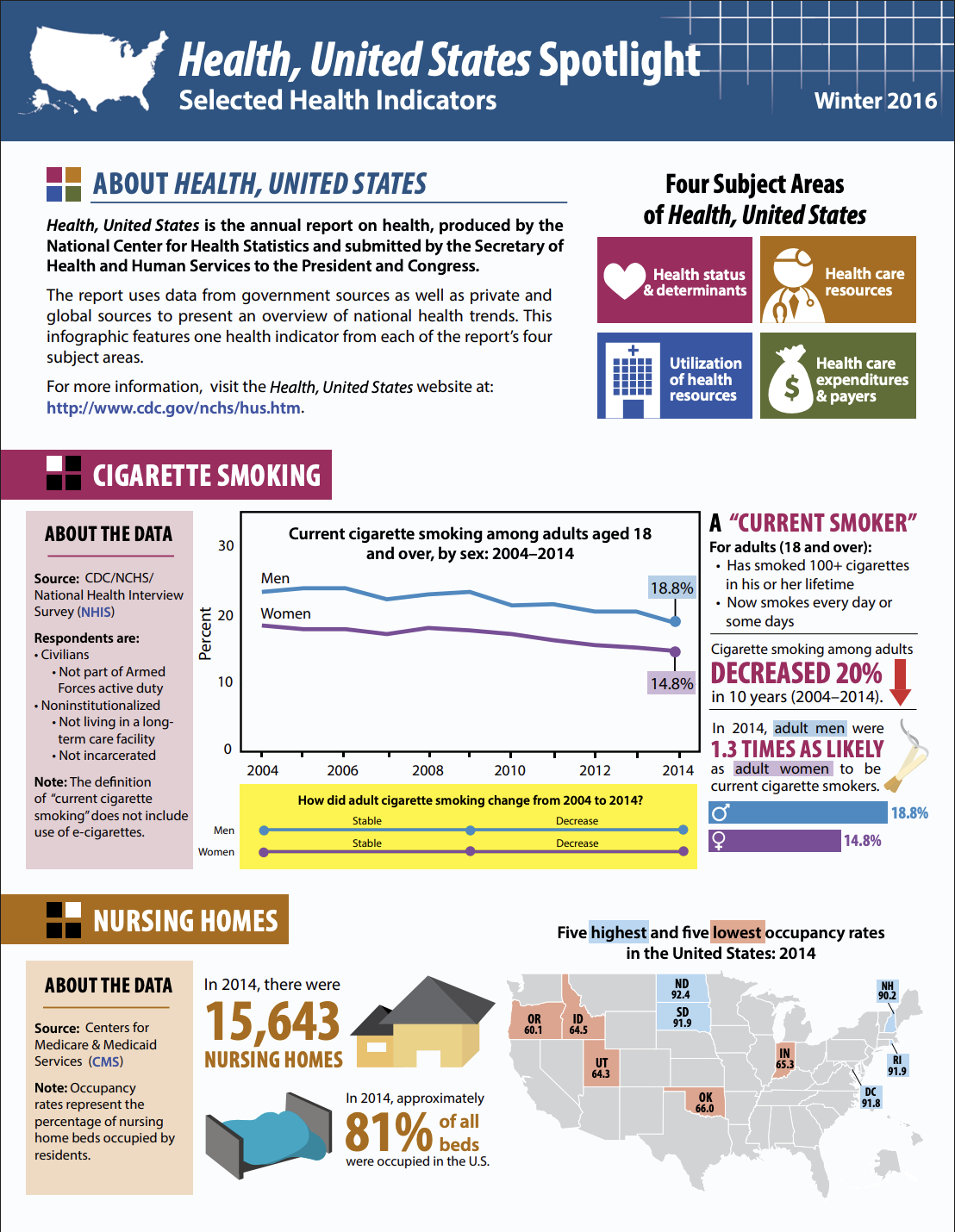
This infographic about health helps us think about best practices for design. The image appears on the National Center for Health Statistics website and is being used under fair use (The National Center for Health Statistics retains the copyright).
This second infographic about health also helps us think about best practices for design. The image appears on the Statistical Modeling, Causal Inference, and Social Science website in a post by Phil Price and is being used under fair use (the creator retains the copyright).
Concluding Paragraph:
With the homework assigned to the class, they are exercising the creative side of their brain and exercising color theory techniques and the principles of hierarchy within the Graphic Design field. By doing so, they will be able to create an effective color palette and layout for a medical infographic, showing the importance of hierarchy when it comes to medical information. People will be more likely to look at an inviting design with the important information popping out at them instead of having to search for it. With the practice of color theory, they will learn and be able to practice the psychology behind the colors being chosen for medical posters. After practicing these ideas, the students will be able to identify what makes an effective medical infographic and see the effect they have from a non-medical background. It will also help them understand the importance of medical infographics overall because of the awareness they spread about simple or complicated illnesses, treatments, or procedures.
Works Cited
“What Is Visual Hierarchy? .” The Interaction Design Foundation, Interaction Design Foundation, 25 Mar. 2025, www.interaction-design.org/literature/topics/visual-hierarchy#:~:text=In%20design%2C%20hierarchy%20organizes%20elements,and%20making%20it%20stand%20out.
“Color Theory: The Effects of Color in Medical Environments.” The Aquila Digital Community, May 2013, aquila.usm.edu/cgi/viewcontent.cgi?article=1173&context=honors_theses.
“Total Covid-19 Vaccine Doses Administered.” Our World in Data, ourworldindata-org.translate.goog/grapher/cumulative-covid-vaccinations?_x_tr_sl=en&_x_tr_tl=es&_x_tr_hl=es&_x_tr_pto=tc. Accessed 29 Apr. 2025.
“Infographics – Health, United States – Products.” Centers for Disease Control and Prevention, Centers for Disease Control and Prevention, 19 Dec. 2017, www.cdc.gov/nchs/hus/spotlight/SelectedHealthIndicators.htm.
Mathieu, Edouard, et al. “Coronavirus (COVID-19) Cases.” Our World in Data, 2 May 2020, ourworldindata.org/covid-cases.
Price, Phil. “One of the Worst Infographics Ever, but People Don’t Care? | Statistical Modeling, Causal Inference, and Social Science.” One of the Worst Infographics Ever, but People Don’t Care?, 27 Aug. 2014, statmodeling.stat.columbia.edu/2014/08/27/one-worst-infographics-ever-people-dont-care/.