Now this may sound crazy but, wouldn’t you rather eat a beautifully plated meal over a meal where everything is so messy and nothing looks pleasing to the eye? No? Okay well then that might just be me.
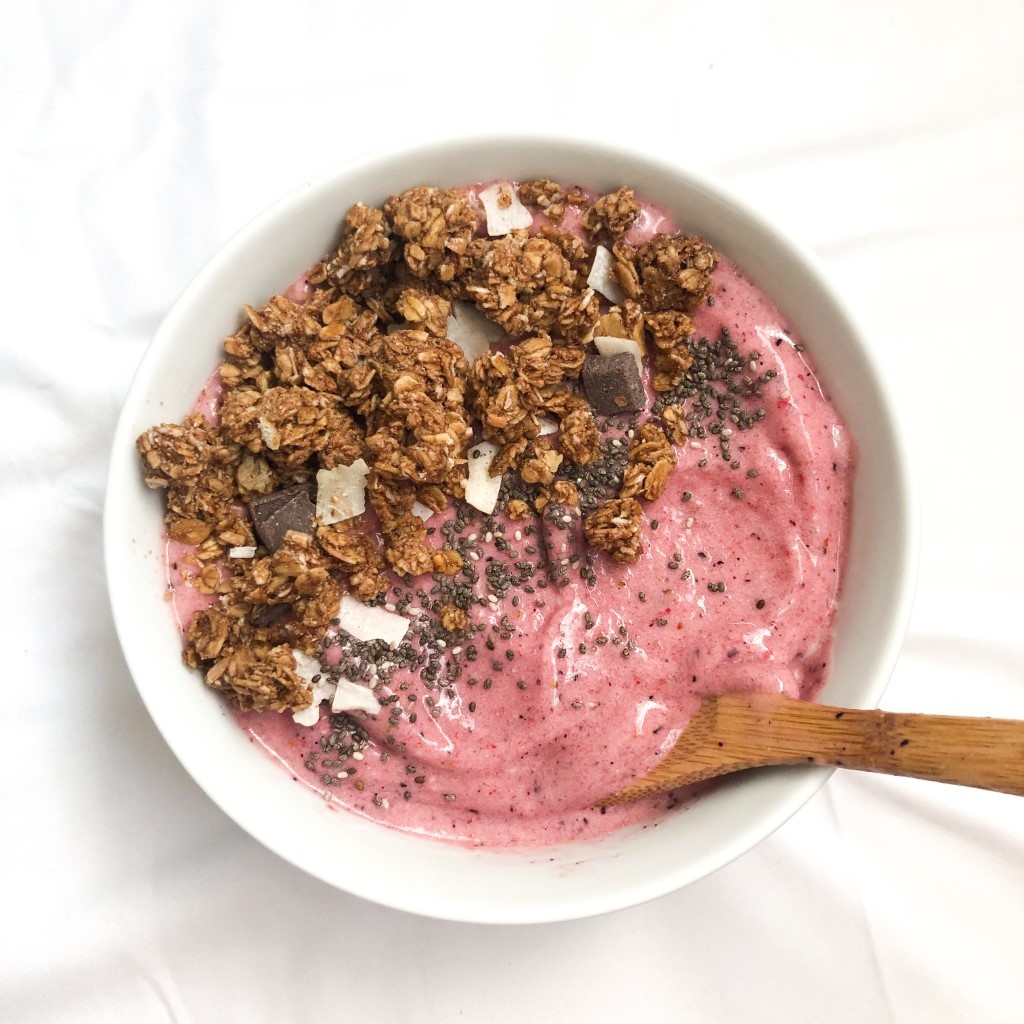
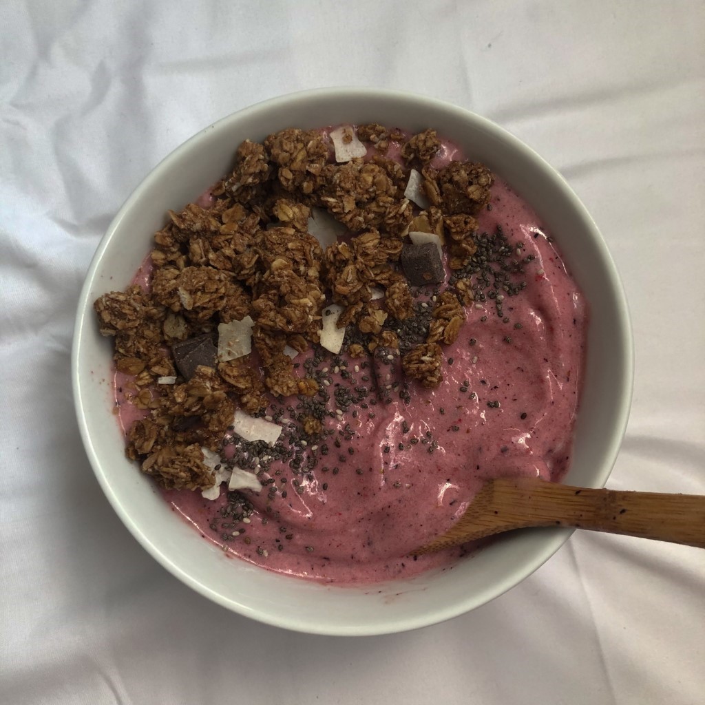
All my life I have always judged my food off of looks and smell. More specifically looks. I feel like the placing and combinations of food is truly a form of art. Let me show you a few examples of pictures of food that I have made. I’ll be showing the difference of brightening the appearance to make the food look more appetizing. Let me just start by saying that this is the SAME exact photo. One is edited with basic skills and the other is simply just a plain old photo in terrible lighting. Now let’s be honest, if I were searching on yelp for a place to get a smoothie bowl and I saw the first bright photo that looked so tasty and refreshing I would without a doubt spend $15.00 on that smoothie bowl. On the other hand, if I saw the dull boring photo with terrible lighting, I would simply think that the smoothie bowl is very mediocre and not worth my money. I hate to say this, but I trick my family with making my food look beautiful every single time. They truly think I’m some sort of chef when in reality, I made a very basic smoothie bowl.
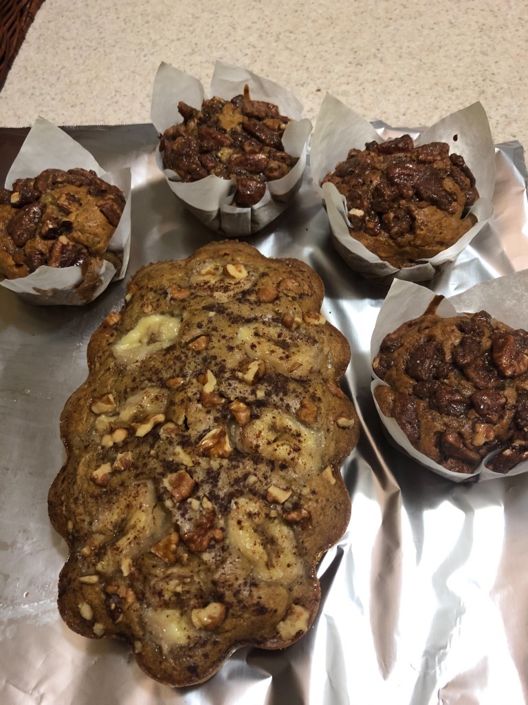
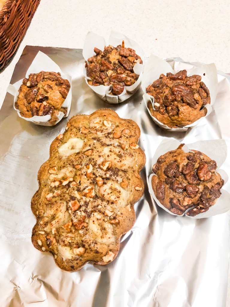
Another great personal example that I have is this photograph of my banana nut bread and muffins. Now the first picture is the harsh reality of homemade healthy banana nut bread. It looks brown, boring and unappetizing. If someone were to send me the first photo and say “Hey I made some banana nut bread! Would you like some?” I would simply reply with “I’m so sorry im allergic” Because boy I don’t even want that bread NEAR me. Now if someone were to send the second photo, I would truly pay for the recipe of those bright, tasty muffins. What truly pops in the edited picture is the best parts, the caramelized crispy pecans, the slices of sweet banana on top of the bread and the crispy top of the muffins. It shows the contrast between the light fresh banana and the dark warm toasty cinnamon on top of the bread. In the other photo, there’s not really much color contrast. The whole photo looks very cool toned and dull. While on the other hand, the second picture has a mix of cool and warm deep undertones. The deep brown colors of the muffins against the white hand cut parchment paper, the gray aluminum foil really helps the white parchment paper stand out as well which then switches into the deep brown muffins. Although the muffins don’t have the nicest background it has a lot of color contrast which helps a lot. If I had time to retake this photo and place everything nicely, I would love to add more warm tones to the cool background. I would not include the foil and I would place the loaf on a nice milk white dish and I would add colorful items as well. Maybe I would include small pinecones, spare nuts, and maybe a small slice to show the inside of the loaf or the muffin cut in half. I would also add butter to show that this recipe goes great with a smear of butter.
Furthermore, I don’t only think that the lighting makes food look so appetizing, but I also believe that the placement does as well. For example, bread art. Bread art is a fairly new trend that has become extremely popular over the past few months. It is simply beautiful edible bread that is very artsy. Here is a beautiful example of a focaccia loaf bread art made by Elizabeth Marek from sugargeekshow.com. From what I can see, the focaccia is savory yet sweet from the baked peppers and tomatoes. The peppers add a lot of life to this bread because it is very warm toned yet vibrant. The strong colors of the peppers pop a lot on the plain canvas of the focaccia, especially the red peppers and red grape tomatoes. The onions do not pop as much because the bread is a light color and so are the onions. They do have a bit of a cool purple tone, but it does not pop too much because they almost fade into an off-white tone that melts into the bread. Its savory from the bread and onions and herbs. It looks almost as if the bread is fluffy yet not to fluffy. It’s not too thin or thick. I assume that this is the texture of the bread because the bread looks like it did rise a bit from the empty dark corners of the right side of the pan. It shows that it did rise but, it did not overfill the pan which gives me the assumption that it is not too fluffy either. The bread looks warm and soft with a little crisp on the top but mostly on the edges from the warmth of the pan. I must say the pan does not look very clean. It throws off the fresh feeling of the bread. I would suggest putting the bread on a milk glass serving tray to show the color contrast of the warm tones from the yellow bread, red peppers, red cherry tomatoes and orange peppers from the cool white serving tray. I think it will also make the photo overall look cleaner.
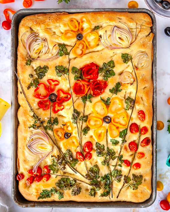
Truly stunning. It’s almost hard to believe that this is even real. Now honestly how tasty does this look? I don’t even like peppers, and I would genuinely enjoy receiving this loaf of bread. Its bright, beautiful, has great placing which truly makes you believe that this MUST be tasty. Simply by the way that the bread looks. I must say, I am truly one of those people who eats with their eyes. If it looks good, it must taste good.